Facelift
It’s not been many months since I moved my personal blog from PyBlosxom to Tumblr. Before that I used a set of my own scripts on Zope (originally DTML and later ZPT), and before that my website was generated by my own custom-written HTML preprocessor. I blame Dom (or does he prefer to be called Dominic now?) and Mirto for pointing out Tumblr to me, and blame various other friends for dragging me kicking and screaming into the user-generated-content era of “Maz 2.0”.
Originally I used one of Heather Rivers’ templates for the Tumblelog, Thought Cloud, with a few tweaks and customisations of my own. However, fluffy clouds and blue skies aren’t my thing: I’m a Mancunian, and I’m not a designer. Boxes are more my sort of thing, and so I’ve spent a couple of hours redoing the design of my blog and thought I’d explain what it does.
Firstly a little about the style. It is a reprise of a design I used for my personal website in 2001-2004 using lots of borders. Under the hood there are lots of <div> blocks floated left and right. The posts alternate between left and right, which involved a bit of a kludge in Tumblr’s templating language, but it works in the end. The colours of the borders represent the hour that the post was made using the following scale which comes from Gimp’s “Polluted Skyline” gradient . On the left is 00:00, on the right is 23:59.
![]()
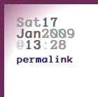
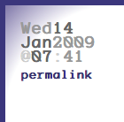
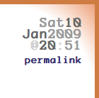
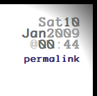
Here are a few examples of the colours in action:


The gradient backgrounds were prepared in Gimp and then rotated using ImageMagick. They use the same base hue as the border colours only much lighter.
I kept a few ideas from Heather’s theme that I used previously:
- I liked the black background for video and photo posts.
- I also plagiarised the tinting of the post date/time so as to preserve horizontal space.
- The static cloud is cool, but I felt the navigation should also have stayed put rather than scrolled with the content.
- I expect I shall plagiarise/develop/release some more from her codebase, especially things like her Tag Cloud.
The “meta” block with the date and time of the post has a few useful features. The date is a link to a page containing all posts made on that day. The time is also a permalink to that individual post. Tags are listed below, and each is a link through to a tag page.
The site’s main font is Spranq’s EcoFont, but Verdana is a good second choice; else your browser’s default sans-serif font will be chosen. Similarly I prefer Anonymous for monospaced fonts (used for some navigation links and program code), but your browser’s default is the fall-through choice.
None of this has been tested in Microsoft’s Internet Exploder, but it all looks cool in Safari and Firefox.
